
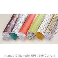
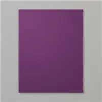
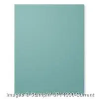
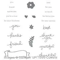
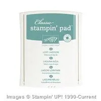
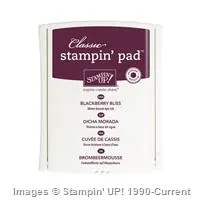
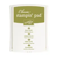
My favorite hands down, #1 thing about Stampin’ Up! is that they detail out the names of all the colors (see what I mean) they use in their Designer Series Paper (DSP). That way it’s so easy to stay within the one color scheme without having to worry if it’s the same shade of blue or green or whatever color you’re looking for. The Wildflower Fields DSP uses Blackberry Bliss, Old Olive, and Lost Lagoon (amongst others) and those are the ones I went with for this card.
Therefore, when matching the base colors, ribbon, and even ink – Stampin’ Up! makes it SO easy! It’s all perfectly matchy-matchy, which for people like me who are a bit obsessive with things like that, it takes the pressure off.
Enjoy!

Built for Free Using: My Stampin Blog
Sweet card! Love the layering and your colors are just perfect! 🙂